Introduction
Why would an AI assistant based inside messaging apps need its own companion web app?
Chronicler is an AI-powered assistant that lives inside your messaging apps. It automatically transforms self-texts into todos and notes, acting as an all-in-one task manager and second brain.
While Chronicler is mainly used within messaging platforms like WhatsApp, there's only so much you can do within the confines of one. Here are some activities that would be difficult or impossible to do by just messaging Chronicler:
- Reviewing todos/notes:
- When you query Chronicler for todos or notes (based on due date, related search term, etc.), you can only get a limited text response back.
- In order to get an overview of all your todos, you'd either have to wait for Chronicler's review texts (which isn't grouped) or constantly ask Chronicler, which would be hassle.
- Editing todos/notes (especially in bulk):
- While it's technically possible to manage multiple todos through chat, you'd have to manually type each one. And the same can't be said for notes. In general, it'd be more difficult to edit in bulk via chat.
- You can't format your notes through chat alone.
- Creating tags/lists:
- As of now, tags and lists cannot be made in chat due to infrastructural limitations.
- There's also a lot more steps that would be difficult to do just inside of a messaging app (i.e. choosing color, selecting notes/todos)
- Configuring settings:
- Without a web app, where would one connect their messaging account or calendar?
- And how would one decide how much they want to be notified by Chronicler?
In summary, due to messaging app limitations and AI's unpredictability, it's necessary for Chronicler to have a companion web app.
Context
I was asked to take over the design of Chronicler's web app after the founder let go of the previous contractors. They did this because of the following reasons:
- They didn't fully understand the product
- They were making visual design mistakes like unclear hierarchies, low contrast color pairings, etc.
- They were also not using a design system at all, creating everything manually
While the contractors were able to provide designs for an MVP, the founders knew they needed a cleaner and more comprehensive redesign of the web app before they could launch Chronicler to the public.
So in the span of 1-2 months, I redesigned the entire Chronicler web app across multiple pages (i.e. Todos, Notes, Tags, Settings, etc.) for both mobile and desktop breakpoints.
- I utilized shadcn/ui components, leading to more consistent designs and faster development
- My redesign not only tackled visual polish, but also improved UX (e.g. more distinct tags/lists, more granular filtering for search, easier note editing experience)
I've also been shipping front-end improvements to the web app to address implementation gaps that were affecting usability + design consistency, such as (but not limited to):
- Adding list selection to the todo creation flow
- Updating tag + list spans to reflect user's chosen color, making them easier to differentiate
- Truncating content of note preview (i.e. description, audio transcription), making it less "chunky"
- Enhancing mobile responsiveness in general through layout adjustment + truncation.
Walkthrough
The Chronicler web app
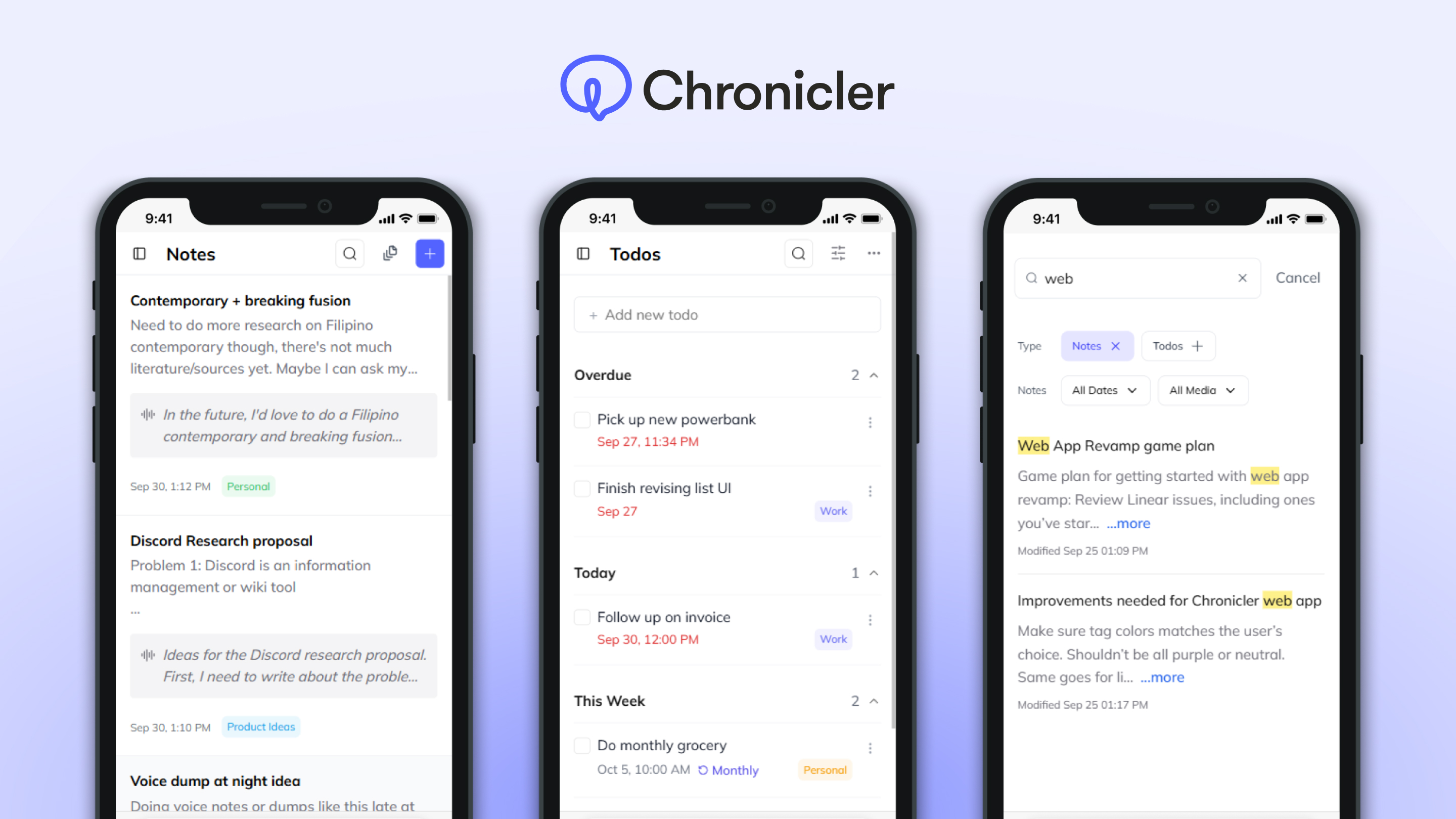
Notes
For users who mainly use Chronicler to save notes, the web app serves as a place where they can easily review all that they've saved so far. This is also where they can refine their ideas further; users can flesh out initial ideas with rich text formatting, and efficiently manage their collection by using bulk actions to tag or delete multiple notes simultaneously.
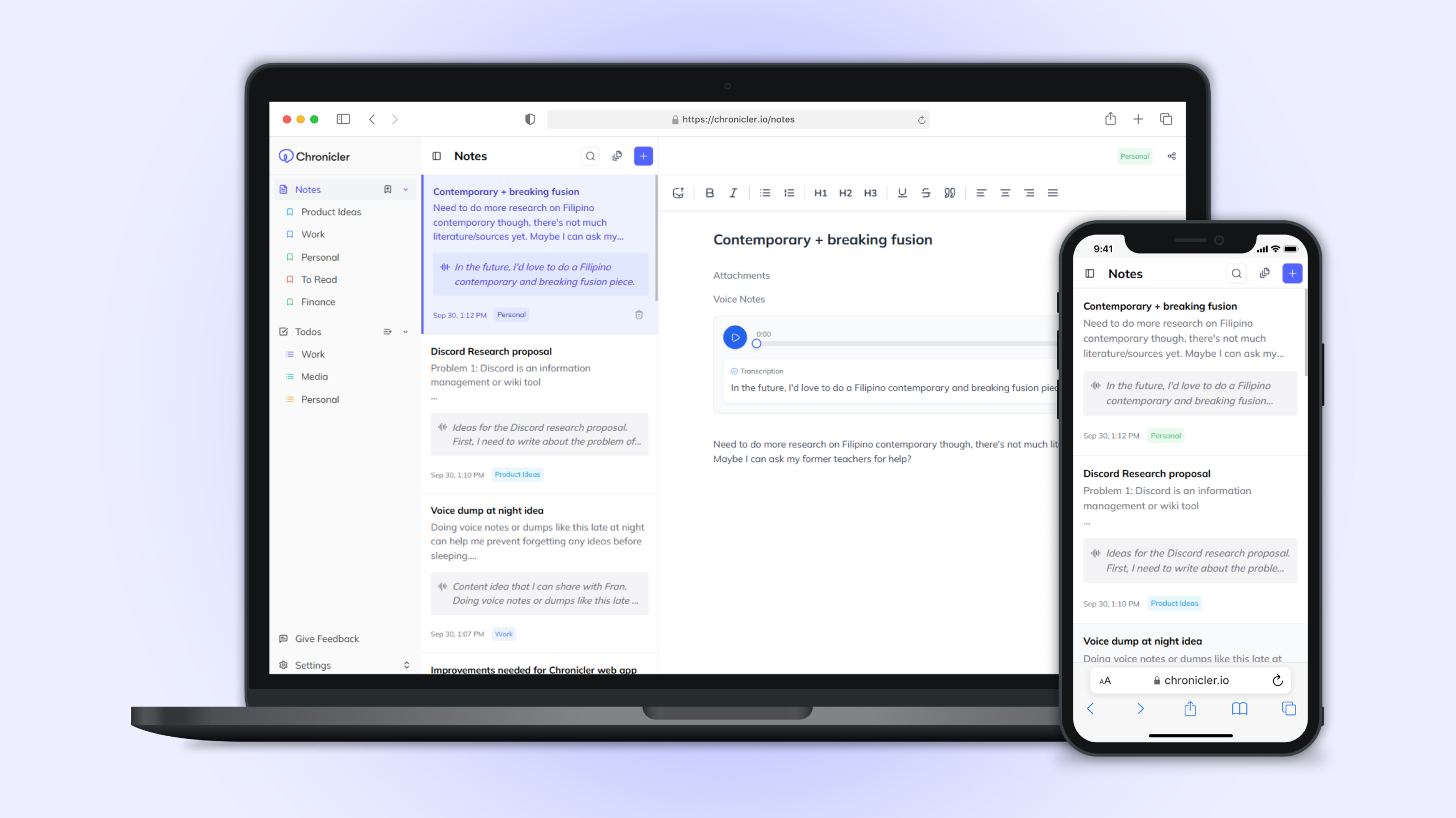
Desktop and mobile views of the Notes page
Editing + tagging individual notes
Bulk selecting notes
Todos
The web app provides a centralized dashboard where users can review their todos all at once, then efficiently manage them by editing individually or deleting in bulk.
While most todos are created via chat, the web app was essential for introducing features that couldn't be handled through chat yet (e.g. creating recurring todos, adding todos to a list).
Desktop and mobile views of the Todos page, along with available Group By options (i.e. none, date, list)
Todo options: renaming, editing time, moving to list, and deletion
Bulk deleting todos
Todo creation flow
Tags & Lists
Tags and Lists act as the primary systems for categorizing notes and todos within Chronicler. Tags, which have a flexible many-to-many relationship with notes, allow for multiple categorizations. Lists, with a one-to-many relationship, offer a more structured way to group todos.
Since most users tend to just add notes + todos without categorizing them (showing low engagement with the web app), Chronicler automatically assigns tags + lists to new notes and todos after a short period of time. This depends on the title and description defined by the user, which is why I thought it was important to mention during tag/list creation.
However, since this AI-driven categorization isn't perfect, users need the ability to reassign categories. This can be done on the Notes and Todos pages, or more specifically within individual Tag and List views, where users can prune unrelated items.
Personally, I'd prefer having a unified Tags system that encompasses both notes and todos. This is because I naturally associate both types with the same categories (e.g. having notes and todos that are both related to "Work"). While the founders considered this approach, it would've also required significant infrastructural changes to implement, which is why they decided to implement separate groupings first.
Desktop and mobile views of individual Tag + List pages
Tag creation flow
List creation flow
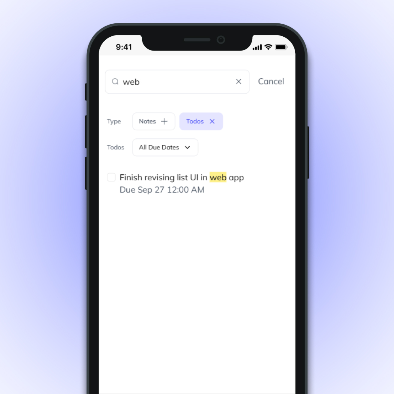
Search
The search modal is present across almost all the pages of the web app. It is automatically filtered depending on where the user accesses search; for instance, if they access search from the Notes page, their search would be automatically filtered to search only notes.
They can also filter the search depending on what type they are searching across. Notes can be filtered based on attached media and creation date. Meanwhile, todos can be filtered based on due date.
Users are also linked to a search URL whenever they query Chronicler in chat. If they want to see all results, they can simply click on the link to go to the web app.
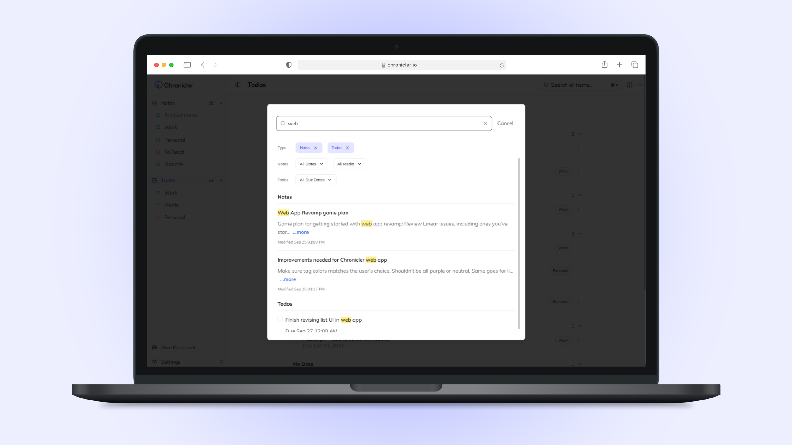
Desktop view of search modal, showing results across both notes and todos
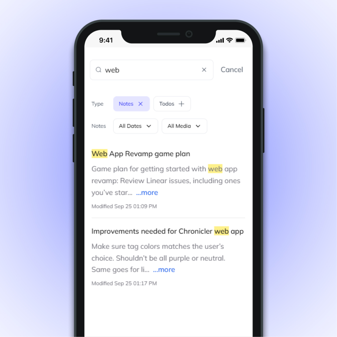
Mobile view of search modal (notes only)
Mobile view of search modal (todos only)
Proposed Improvements
How can Chronicler be better?
I'd consider the current state of the product to be MVP. There was much more that needed to be done in order to improve the user experience; however, the founders decided to pivot away from Chronicler due to product-market fit. Nonetheless, here are some ideas I would've loved to implement:
AI Captions for Media Attachments
To enhance searchability across notes, Chronicler automatically generates descriptions for media attachments—describing images, transcribing audio, and scraping text from links. However, these auto-generated descriptions can be excessively long and often include irrelevant details, which visually clutters the notes and obscures the user's own content.
My proposed solution is to introduce summarized AI captions. These would display only the core insights (a "TL;DR" version) instead of the full text. For user controllability, these captions would be editable and support rich text formatting, following a model similar to Evernote's AI Transcribe feature.
Various types of media attachments for notes
Collapsible captions for long descriptions
Sub-Todos
User feedback indicated a strong need for organizing todos into hierarchical clusters/projects (e.g., "Recordings to make:" containing sub-tasks for specific reels). My proposed solution is revamping the todo component to launch a dedicated detail view within a drawer or dialog. This expanded interface provides the necessary space to manage sub-todos and additional metadata without cluttering the main list view.
For clarity, here is how this detail view is structured:
- Header: Displays the todo's name and checkbox
- Content: Displays the main todo's core properties (due date, list, and a new description field) along with a dedicated sub-todos section
- Footer: Houses primary actions like "Edit" and "Delete" for the parent todo.
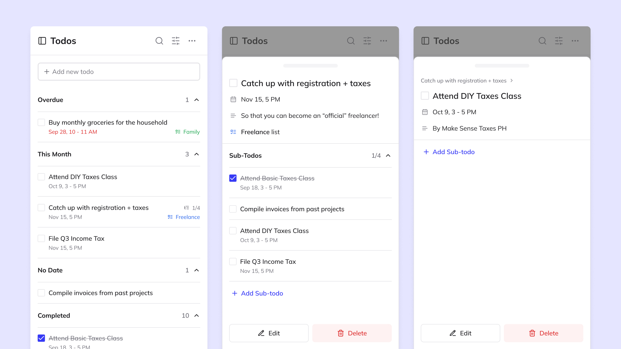
Featured from left-right: Main todos page (left), Drawer for todos (center), Drawer of a sub-todo (right)
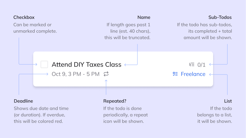
Breakdown of revised todo component